The Saturation Slider Cannot Repair Every Colour
Learn why a global saturation boost can make phone photos feel less balanced, and choose targeted edits that correct colour without muddying the image.
When a phone photo looks dull, pushing the saturation slider often makes the wrong colours louder rather than fixing the ones that feel weak. In phone photo editing, treat saturation as a broad adjustment, not a repair tool: first identify what is off, then choose a control that affects that colour or tone more precisely.
Strong colours can crowd out the subject
A global saturation boost intensifies colour across the whole frame. If a portrait has a vivid red jacket against green foliage, increasing saturation may deepen both the red and the green. The background can become more distracting even though the jacket was the detail you wanted to emphasise.
Start by asking what the viewer should notice first. If one object needs more presence, use a selective colour tool or a small local adjustment if your editor offers one. Otherwise, try reducing the competing colour rather than boosting everything. In Snapseed, for instance, selective adjustments can target an area; in Lightroom Mobile, colour controls can isolate a colour family.
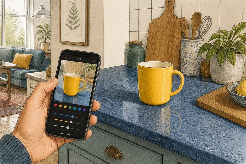
Say you have a photograph of a yellow mug on a blue kitchen counter, and the mug looks timid. Imagine lowering the blue’s intensity slightly with a colour mixer, then making a restrained adjustment to the yellow. The expected visible result is a clearer distinction between mug and counter, without turning every coloured surface in the frame more intense.
Muted colour may come from exposure, not saturation
A photo can look washed out because bright areas have lost detail or because the whole image is too bright. Saturation may add colour, but it cannot restore texture in a pale sky or bring detail back into an overexposed face. It can instead make surviving colours look harsh beside blank highlights.
Check exposure before colour. Lower highlights if bright areas look too strong, and adjust overall exposure only if the whole frame needs it. Then look again at the colour. If the image still feels flat, a modest vibrance adjustment may help: in many editors, vibrance gives quieter colours more lift while being gentler with already vivid ones. It is still a global adjustment, so inspect skin and bright objects afterwards.
One colour may be wrong while the rest look right
When only a red coat, green lawn or blue sign looks unnatural, raising or lowering global saturation changes unrelated colours too. The cause may be the colour’s intensity, its hue, or the lighting that fell on it. Those are different problems, so avoid treating them as interchangeable.
Use a colour mixer or HSL panel, where available, to work on the relevant colour family. Saturation changes its intensity; hue shifts it towards a neighbouring colour; luminance changes how light or dark it appears. Make one adjustment, pause, and compare the whole frame rather than judging the isolated object alone. A small hue shift can make foliage look less yellow, for example, but a large one can make it look artificial.
If your editor has no targeted controls, try a local adjustment on the object or leave the colour as it is. A slightly imperfect colour is often less distracting than an obvious edit that alters the rest of the photograph.
Skin can turn harsh before the background looks lively
Faces are quick to reveal excessive saturation. Lips may become too bright, cheeks too orange, and small patches of red more noticeable. This often happens because a global boost also affects skin tones, even when the original goal was to make the surroundings feel richer.
Reduce saturation slightly if skin already looks vivid, or use a selective skin-tone control if your app provides one. If the face looks too warm or too cool, adjust white balance or temperature before adding colour. White balance changes the overall warmth of the image; it is not a substitute for adjusting one colour in a scene. Check the face in context, including clothing and nearby surfaces, so that a correction does not leave the subject looking detached.
It is not worth chasing perfectly uniform skin colour across every patch of light and shadow. Preserve natural variation, and stop when the face reads comfortably alongside the rest of the frame.
Colour problems are easier to diagnose in a short order
Before reaching for saturation, work through a simple sequence:
- Check exposure. If highlights are pale or shadows are heavy, correct the tonal problem first.
- Check white balance. If the entire scene looks too warm or cool, adjust temperature or tint before targeting individual colours.
- Name the colour that bothers you. Decide whether it is too strong, too weak, too light, too dark or shifted towards the wrong hue.
- Choose a matching control. Use a colour mixer for a colour family, a local adjustment for one area, or vibrance for a gentle broad lift.
- Inspect the whole frame again. Look at skin, bright details and background colours, not just the object you edited.
- Compare with the original. Toggle the edit on and off, and keep the version that feels more believable rather than merely more vivid.
Which colour control should you try first?
Should I use vibrance or saturation?
Try vibrance when several colours feel subdued but some are already strong, since many editors apply it less aggressively to vivid colours. Use saturation for a broad, deliberate change, and keep the adjustment modest enough that skin and bright objects remain natural.
Why do my phone photos look orange indoors?
Warm household lighting can make a whole scene appear orange, so a white-balance correction may be more suitable than reducing saturation. If only one object is orange, use a targeted colour control instead of cooling the entire frame.
Can I fix a single colour without changing the rest?
A colour mixer or selective adjustment can limit the edit to a colour family or part of the image. The result may still affect other objects with similar colours, so check the entire photograph after each change.
Why does a saturated edit look fine on my phone but harsh later?
A bright display can make edits seem less intense than they appear elsewhere, and a small screen can hide colour clashes. Review the image at a comfortable brightness and, if possible, in the same app where you plan to share or keep it.
Keep the edit tied to the original light
Colour depends on the light in the scene as well as the object itself. A blue jumper in shade may look different from the same fabric in direct sun, and a colour edit cannot make those conditions identical without changing the character of the photograph. Aim for a convincing image, not a uniform one.
For phone photo editing, the useful question is not “How much more saturation?” but “Which part looks wrong, and what kind of change would address it?” Fix tone or white balance first when the whole image is affected; isolate a colour or area when the problem is local. Once the subject reads clearly and the colours still make sense together, leave the slider alone.